unseenmag.com is launched!
right now it's basically a template for what's to come...my little knowledge of web design made for a pretty simple site. but i wanted to have something to show people so we can start publicizing the mag more and getting lots of submissions.
a while back i made fliers to hang up around whatever town you find yourself in. i'll work on linking it in pdf form so you can print it out. would be great to have a street team to help spread the word.
meanwhile, i would love for all of you to work on some submissions! right now i want to get as much work as possible so we can put out a really dynamite issue.
besos--
a
Tuesday, July 14, 2009
Monday, July 13, 2009
Sorry to take up space.
I know there are some writers in this group. I'm interested in where you went to school and how you like it? Sound like I'm interested in becoming a writer? You would be correct.
Oh, and where is the website? Is it launched?
Thanks!
Jackie
Also, has anyone been to India?
Wednesday, June 24, 2009
homepage designs


here are some designs i've been working on. what are your thoughts? also accepting any suggestions for ideas--
more to come!
Monday, June 22, 2009
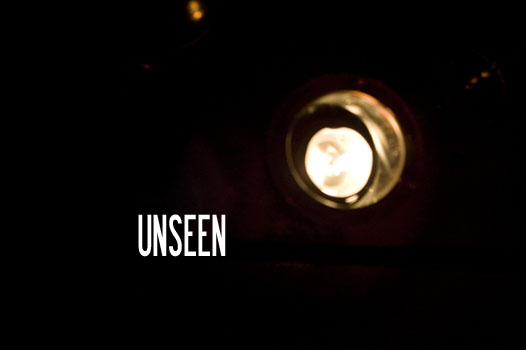
UNSEEN MAG WEBSITE LAUNCH
so maybe you thought unseen had faded into the oblivion of good intentions and failed follow-through. no so!
the unseen mag website launch will take place on july 1st. until then, i'll be slaving away to make something really pretty that we can show people that don't know what this is all about and they will feel so obligated to submit something that we will get stuff from like, famous people. or else we'll all just become famous. i can deal with that.
yay! be on the lookout. also i might be asking for suggestions here, so keep checking back. since i know you check unseenmag.blogspot.com daily.
Saturday, May 9, 2009

Friday, March 27, 2009
hiiiiiiiii
oh unseen, my dear blog that has gone long neglected.
things are happening! just behind the scenes.

here is a flyer. once the site is up we can throw these around our respective towns like some wicked flurry of snowflakes in canada. get ready!
things are happening! just behind the scenes.

here is a flyer. once the site is up we can throw these around our respective towns like some wicked flurry of snowflakes in canada. get ready!
Tuesday, February 17, 2009
response to le website interface post

i have nothing to say about that .gif, i just thought it was funny.
i find a simple interface really, really appealing. especially as we are dealing with involved content (i.e. essays, photography, articles and art) that asks your conceptual participation... i feel like a convoluted website would be overkill. sexy, simple, with essential information.
example of bad, convoluted interface: fecalface. that, and the name is really kinda unbearable (i'm sure people would disagree with me) BUT the content is awesome BUT the homepage makes me panic. literally panic. okay not literally.
profiles and links to artists' sites: good idea. especially for people who are trying to get their work out there and circulated. if the printed media is where we are really going to concentrate on putting together pieces of artwork into an integrated, whole work then allowing the website to give us more context is a great idea (context i.e. who the artists are, what they do individually, their statements and bios etc.)
actually i like that. the magazine and the website are complementary. text and context.
so. would that image in the previous post be the actual homepage? if so, i like it. i also think, though, that instead of the sleek and quiet fonts that perhaps allude too much to interior-design-webstores and the like, what if we did something with the same simplicity but more flesh and color:
http://www.bloomsberry.com/
new zealand-based chocolatiers . find their website really appealing bc it has the simplicity of something you could hold. it's charming, it's simple, slightly sinister, and it's not trying too hard to sell itself or genre itself. and i don't panic about where to find information. it's just simply pleasing.
click around on it - it's awesome. and i call and talk to the people about what/who they are using to design this - we carry their chocolate in the store where i work.
well. i was going to linkup http://www.cranbrookart.edu/Pages/Ceramics.html (cranbrook academy of art) because they used to have an interesting and appropriate website for their different disciplines - each was different based. but. it's a little less interesting than it used to be. worth it to look around on, anyway.
brian knox (who isn't reading this blog or the emails but soon will be... as soon as i remember to email him) has a 2d design style that i would love to be visually associated with - rich color scheme, ambiguous imagery, not serious, not overly ironic, and what i find most appealing - it's like nothing i've encountered. i don't know his level of experience with putting together a website. hah. great with photoshop though! surely those skills transfer.
alright that's all i have today.
Subscribe to:
Posts (Atom)